
01
Better Mobile Experience
Content, menus and actions stay usable on smaller screens where many customers first discover a business.
Responsive Website Designing
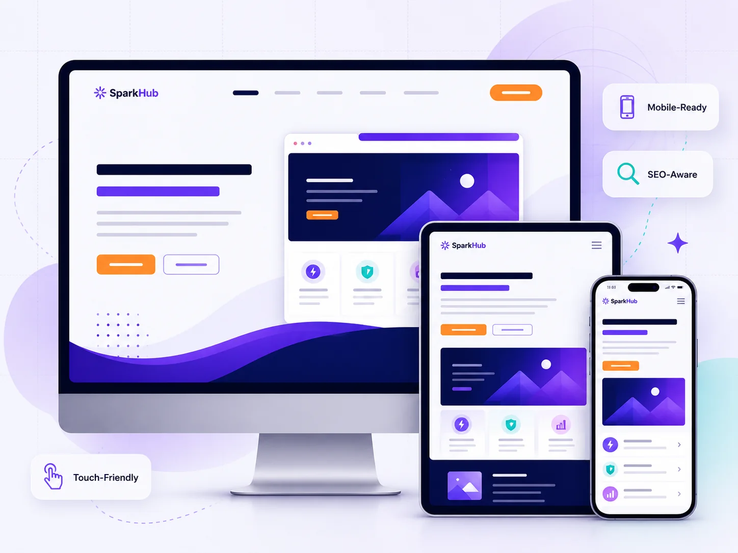
Mobile, tablet ya desktop — your website should stay clear, readable and easy to use. We design responsive business websites so customers can understand your services and take action without fighting the layout.
Jamshedpur-based support · India-wide delivery
Why responsive design matters
A business website may be opened from a phone during travel, a tablet at a counter or a laptop in an office. Responsive design adapts the interface instead of forcing visitors to zoom, scroll sideways or search for important actions.
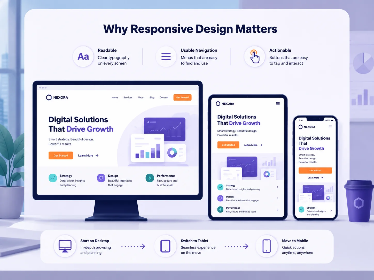
Content, menus and actions stay usable on smaller screens where many customers first discover a business.
Important sections and enquiry actions remain easy to find instead of getting buried in a compressed layout.
A mobile-friendly structure supports usability and avoids maintaining separate desktop and mobile pages.
Responsive planning helps control media, spacing and visual complexity instead of simply shrinking everything.
What we make responsive
Responsive design means planning how the important parts of the website behave when available space changes — not adding one mobile breakpoint at the end.
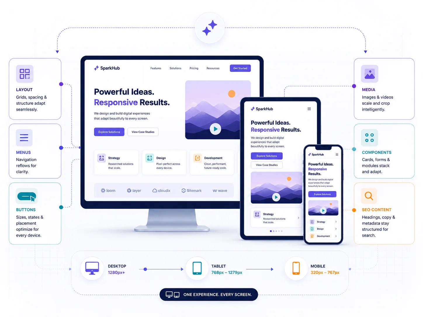
Sections reflow naturally so text, images and business information remain easy to scan.
Desktop navigation becomes a practical mobile menu instead of a tiny compressed menu bar.
Calls, WhatsApp, enquiry buttons and important controls remain comfortable to tap.
Media is sized and positioned for different screens without breaking the surrounding layout.
Cards, forms, tables and service sections are designed to adapt rather than overflow.
Headings, paragraphs and internal links remain readable without hiding useful information on mobile.
One website · multiple screens
For most business websites, there should not be a separate mobile website and a separate desktop website. We plan one responsive interface that adapts its grid, spacing, media and interaction patterns according to available screen space.
How we work
Mobile usability is easier to maintain when it is considered during layout planning, content decisions and component development — not after the desktop version is finished.
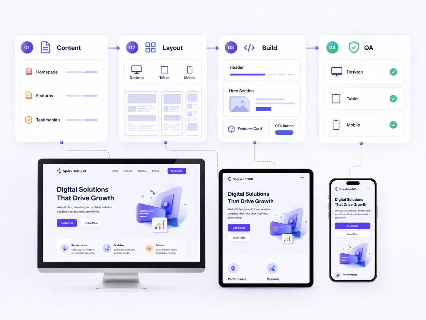
We review what the business needs to communicate and what visitors need to do on the page.
We decide how grids, sections, navigation and important actions should adapt across screen sizes.
The interface is built responsively and checked at practical widths instead of only desktop and one phone.
We review navigation, readability, forms, media and key calls-to-action before the final release.
Jamshedpur-based support with responsive website delivery for businesses across India.
Responsive website FAQs
Straight answers for businesses planning a new website or trying to improve an older desktop-focused website.
Responsive website designing means planning and building one website that adapts its layout, navigation, images, text and actions for different screen sizes such as mobile phones, tablets, laptops and desktop monitors.
A responsive website is designed to adapt across modern mobile screen sizes and browsers. Important layouts, menus, forms and calls-to-action should be tested across practical mobile breakpoints rather than assuming a desktop layout will simply shrink correctly.
Yes, when the existing codebase and content are suitable for improvement. We first review the current layout, navigation, content structure and mobile problems, then recommend whether a responsive rework or a broader redesign is the more practical option.
Responsive design supports a better mobile user experience and avoids maintaining separate desktop and mobile versions of the same website. Search performance depends on many factors, but a clear mobile-friendly structure is an important technical and usability foundation.
Cost depends on the number of pages, content, design requirements, forms, integrations and functionality. SparkHub reviews the actual requirement before recommending scope, so the quotation reflects what the business genuinely needs.